
Colors shape identities. Think about Tiffany Blue or Coca-Cola Red. These colors are instantly recognizable and consistent across every product, ad, or packaging. But how do professionals maintain this consistency? The secret lies in PMS codes, a universal language for colors.
Pantone Matching System (PMS) codes provide a standardized way to identify, communicate, and reproduce colors, ensuring brand consistency across digital and physical mediums.
This guide will teach you how to master PMS codes, from identifying and measuring them to using tools like apps and charts for precise branding.
How are Pantone colors identified?
Pantone revolutionized color communication. But what makes their system so essential for professionals in design and branding?
Pantone colors are identified through unique alphanumeric codes, ensuring precise communication and reproduction of colors in any industry.
Why does this system work?
Each color in the Pantone library has a unique code that eliminates confusion. This consistency allows a logo designed in New York to appear the same when printed in Shenzhen Pantone color system explained1. Pantone codes cover:
- Color Shades: From the lightest pastel to the richest hues range of Pantone colors2.
- Color Applications: For paper, textiles, plastics, and beyond Pantone applications in materials3.
- Material-Specific Adjustments: Ensuring the same look across materials how Pantone ensures material consistency4.
Benefits of Pantone identification:
- Cross-Material Consistency: Avoid color shifts between print and digital mediums importance of Pantone in cross-material printing5.
- Global Standardization: Create universally recognizable colors for brands global Pantone standardization benefits6.
- Efficient Collaboration: Simplify communication between designers, printers, and manufacturers how Pantone improves collaboration7.
Whether you're a designer, marketer, or entrepreneur, learning to identify Pantone colors ensures flawless branding and seamless collaboration why Pantone is Essential for branding.
How to measure Pantone color?
Identifying colors is one thing, but accurately measuring and matching them is another. How can you do it without guesswork?
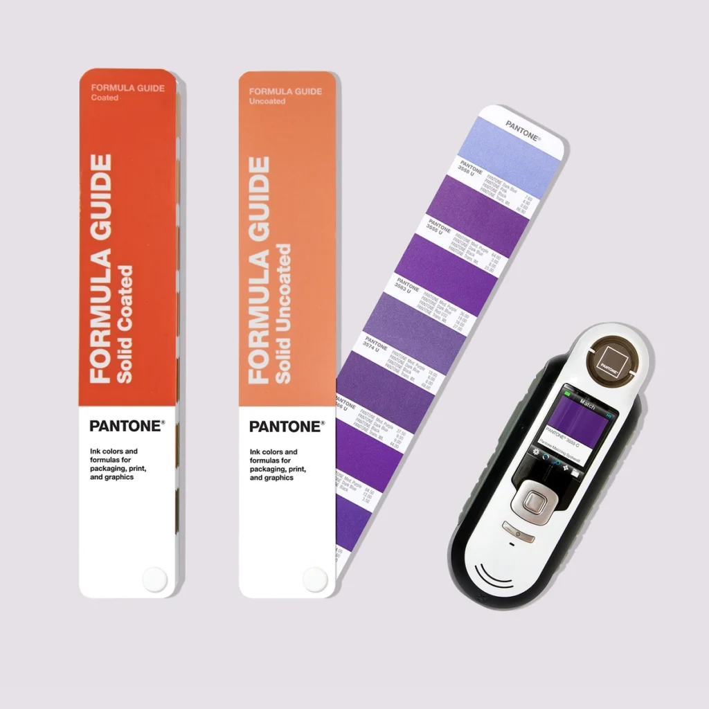
Pantone colors can be measured using professional tools like spectrophotometers, software like Adobe Illustrator, or even online and mobile tools designed for quick matches.
Dive deeper into measuring techniques
1. Spectrophotometers
- These advanced tools measure the exact wavelength of light reflected by a color.
- Results are matched to the closest Pantone code.
- Commonly used in industries that demand precision, like packaging or textiles.
2. Online Color Matchers
- Tools like Pantone's official website allow users to upload images and find approximate matches.
- Useful for quick, budget-friendly solutions, though less precise than hardware tools.
3. Adobe Illustrator
- Adobe's Pantone library makes it easy to locate codes for digital designs.
- Steps:
- Open the "Swatches" panel.
- Select "Open Swatch Library" > "Color Books" > "Pantone."
- Pick the desired color from the library.
- Seamless integration for professionals already using Adobe Creative Suite.
Choosing the right method depends on your needs. For high-end projects, precision tools are worth the investment. For smaller projects, apps or software may suffice.
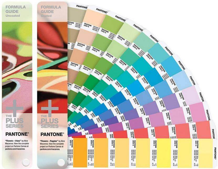
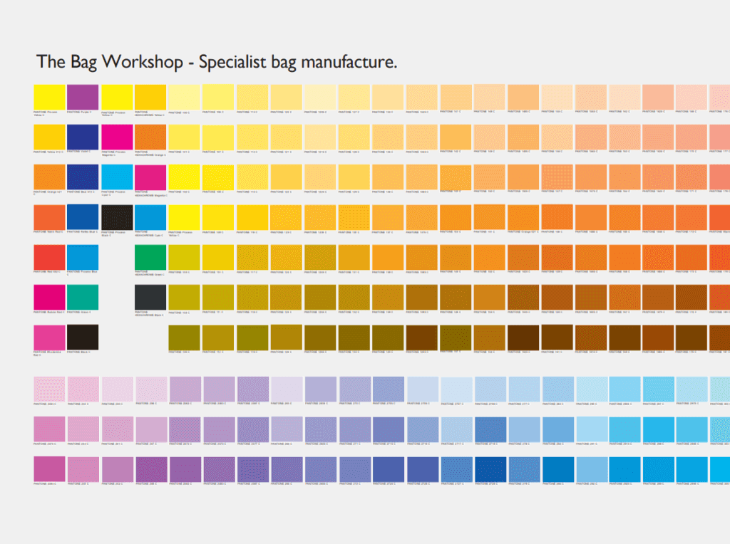
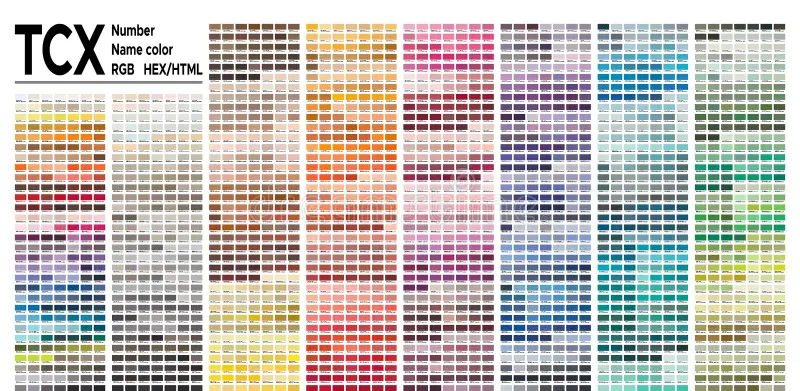
What is the PMS color chart?
Imagine flipping through a book that organizes every shade, from vibrant reds to muted pastels, with a corresponding code. That’s the PMS color chart in action.
The PMS color chart is a comprehensive library of standardized colors that professionals use to find and reproduce shades consistently importance of the PMS color chart8.
What makes the PMS chart essential?
- Organization: Colors are grouped by families (e.g., blues, greens) for quick navigation.
- Physical and Digital Formats: Available as a printed book or within design software PMS digital and physical formats9.
- Applications Across Industries: From graphic design to fashion and product packaging PMS chart applications10.
Breaking down the PMS chart:
| Feature | Digital Design | Print Media | Textiles |
|---|---|---|---|
| Consistency | ✔ | ✔ | ✔ |
| Accessibility | ✔ | ✔ | ✘ |
| Cost-Effectiveness | ✔ | ✔ | ✘ |
By using the PMS chart, professionals save time and ensure their colors are accurately reproduced, whether in digital ads or physical products.
Pro Tip:
Invest in a physical PMS guide if you frequently work with print. It provides a tangible reference, especially when comparing colors under different lighting conditions.
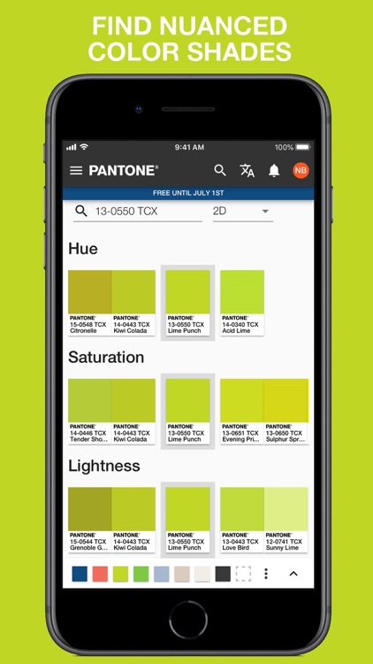
Is there an app to identify Pantone colors?
Technology has made identifying colors more accessible than ever. But are apps reliable for professional use?
Yes, apps like Pantone Connect allow users to identify, match, and integrate PMS codes directly into their workflows, offering speed and convenience.
Popular apps for Pantone color identification
1. Pantone Connect:
- Seamlessly integrates with Adobe software.
- Offers features like color matching, saving palettes, and exporting codes.
- Free and premium versions cater to hobbyists and professionals.
2. ColorSnap:
- Designed by Sherwin-Williams but supports Pantone matching.
- Ideal for interior designers and product developers.
3. Online Color Pickers:
- Budget-friendly options available through web browsers.
- Allows users to upload images and find close Pantone matches.
How to choose the right app:
- Ease of Use: Pick tools that integrate smoothly into your existing workflow.
- Feature Set: Advanced tools like Pantone Connect offer more customization.
- Cost Considerations: Free options work for casual use, while premium apps suit professionals.
Apps are a game-changer for designers and brands looking to maintain color consistency in fast-paced environments.
Conclusion
Pantone colors are more than just codes—they’re the cornerstone of consistent, impactful branding. By understanding how to identify, measure, and apply these colors, you can elevate your designs and maintain brand trust across platforms.
Brilliant Packaging, Thoughtful Care!
Visit TendersPackaging to learn how we use Pantone colors to make your packaging unforgettable.
-
Understand the principles behind Pantone’s globally recognized color system. ↩
-
Learn about the diversity of color shades covered in the Pantone system. ↩
-
Discover how Pantone adapts to different materials for accurate color reproduction. ↩
-
Explore the techniques Pantone uses to maintain color accuracy on various materials. ↩
-
Learn how Pantone eliminates color mismatches across mediums. ↩
-
See why brands trust Pantone for universal color recognition. ↩
-
Understand how Pantone enhances communication in the design and production process. ↩
-
Learn the value of PMS for consistent and standardized color reproduction. ↩
-
Discover the advantages of using both physical and digital PMS formats. ↩
-
Learn how the PMS chart serves different industries with color standardization. ↩